Chan's blog
27.5.12
26.5.12
The Gorgeous Scenes for Rear Windows
http://www.flickr.com/photos/stilgherrian/6364217549/sizes/o/in/photostream/
http://www.flickr.com/photos/stilgherrian/6364218611/
http://www.flickr.com/photos/stilgherrian/6364220491/
http://www.mezzaluna.com.au/index.html
The images above show the nice view at rear of the site!
21.5.12
19.5.12
The Gain of The Second Time in Visiting The Site
The second time I visited the site was 3 p.m. I found the street view and sun direction is totally different from the first time I met.
The site face to Victoria is under the shadow which is generally getting dark, while its rear is face to the west sun with good sight seeing. So I strongly believe that the rear of site is a good position forplacing garden and bedroom of design.
15.5.12
Initial Concepts and Precedent Study of Farnsworth Housee
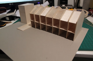
Group Model in Progress!
The facade of terrace which face to Victoria St
rear of the site
Rough Model
simple analyze for Farnsworth House
the stairs next to the terraces!
Brief Response and How to Use His concpts in My Own Design
My Precedent Study is Farnsworths House which is designed by Ludwig Mies Van Der Rohe during 1945-1951.
Resources: http://birdsofoh.blogspot.com.au/2010/10/farnsworth-house.html
From its plan this house is basically formed by two initial rectangle and its mainly structural materials are steel and glass.Mies he has created a fluent circulation for people to walk. This unobstructed design can make people more easier to use facilities of house.
He is also interested in nature. This house is a good example that how the architecture be interacted with surrounding contexts.
To my own design:
By analysis of the site, I find our site is a long long rectangle with hierarchy. So I do think this precedent house can be my initial inspiration. Because when some one wanna visit the gallery, museums or other public exhibitions,the visitors they might wanna see more designs and workings as much as they can. So it is significant that the interior design has to be more flexible and considerable for visitors. What I meant is the fluent circulation is very important to the visitor. This can help out the visitors and remain them to stay inside the gallery.
As art collectors, I think they might hope the others can appreciate them, and certain their effort. The "open to public" design may let more people know what exactly the house do, not just a house for housing, but it can be multi-functional use for the house owner and visitors.
14.5.12
The Site View with Beginning Analyse and Initial Concepts for Double House
Preface
The site is located on a semi-busy road at Potts Point which is now being a restaurant for providing Italian fine dine, it is also sitting in a traditional residential area.
The site is 10x30 meter rectangular shape which is between two terrace buildings.
The site is located on a semi-busy road at Potts Point which is now being a restaurant for providing Italian fine dine, it is also sitting in a traditional residential area.
The site is 10x30 meter rectangular shape which is between two terrace buildings.
the Rear of Terraces
the Restaurant
Terraces
Restaurant and Terrace
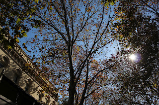
Tree
Internal of Restaurant
Rocky Face
Surrounding Park
Vegetation in Park
Maple Tree?
Some Sketches of Site and Surrounding Contexts
the panorama for the site surroundings
Subscribe to:
Comments (Atom)


.JPG)